 Matthew Bailey
Today is going to be a very special guest review that has been written with the help of a dear friend of mine, actress and international sportswoman Ellie Wallwork. Ellie has been registered blind since birth but is one of the most inspirational people I know. She has appeared in TV shows such as Doctor Who and Call the Midwife, as well as a number of other films and shorts. She also plays for the UK team in Showdown, a sport for blind and visually impaired players that is best described as a cross between table tennis and air hockey.
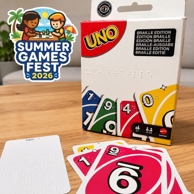
Amid her incredibly busy schedule, I floated the idea of having her review Mattel’s new Braille version of UNO, which was released a few months ago, to see both how well it plays and how well it works for someone who is visually impaired. Luckily, she was up for the task, and today I present her review. Ellie shared her thoughts verbally, and I’ve edited and transcribed them into a written review; hence why it doesn’t quite sound like a normal review from me.
Ellie
Today I’m going to be sharing my thoughts on UNO Braille because I came away really impressed with it overall.
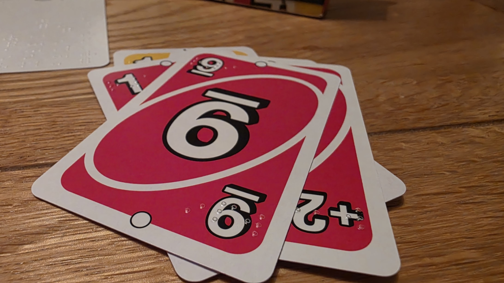
The first thing that stood out to me was just how easy the Braille is to read. The dots are incredibly crisp, making every card feel clear and distinct. That’s one of the most important aspects of a Braille product, and UNO has done an excellent job here.
One feature I particularly appreciated was how the cards are labelled. On previous Braille UNO decks I’ve used, colours would be represented by a letter – for example, yellow would be shown as “Y” – and the numbers would often just use the Braille letter equivalent without a number sign. So a yellow four would effectively read as “Y” followed by the Braille letter “D”, which only represents the number four if you already know it’s meant to be a number. On this deck, they’ve included the proper Braille number sign before the number, making each card much quicker and easier to identify. It’s a small change, but it makes a big difference in practice.
The action cards have also been labelled much more clearly. The Draw Two cards, for example, are written out as “Draw Two” rather than relying on abbreviated wording, making it much easier to understand exactly what the card does as soon as you read it.
I also really liked the way the cards have been designed with Braille in both corners. Every card has the information in the top left and bottom right, meaning you can hold the card in either orientation and still read it immediately. You don’t have to keep rotating the cards to find the Braille, which makes playing much smoother and more natural.
The included Braille instruction cards are excellent as well. They explain what each card means in a very clear, simple way without overwhelming you with unnecessary information. I also appreciated that the instructions are provided in multiple languages while still remaining easy to navigate in English.
There weren’t any Braille instructions explaining how to actually play UNO, but that wasn’t an issue for me because I already know the game. I can’t comment on the printed instructions because, obviously, I can’t read those.
There are a lot of cards in the deck, and because there are duplicates of many cards, shuffling them can be a bit tricky. That’s probably more a reflection of my terrible shuffling than the deck itself, though!
My biggest criticism isn’t actually the cards at all – it’s the packaging. Once you’ve taken the cards out, it’s very difficult to fit them all back into the box again. I also found that the instruction cards can easily get mixed in with the playing cards because they feel exactly the same, making it harder to quickly find the cards you want when setting up.
I’ve ended up creating my own way of organising the deck because using elastic bands or dividers makes it impossible to fit everything back into the original box. I completely understand why Mattel chose this style of packaging, as it works well for displaying the product on shop shelves, but from an accessibility point of view, I think slightly larger or better-organised packaging would make a huge difference for blind players.
Overall, this is a really positive experience. The Braille is clear, crisp and easy to read, the card design has clearly been thought through by people who understand how blind players actually use the cards, and the improvements over previous Braille UNO decks are genuinely noticeable. With a little more thought given to the packaging and storage, it would be very close to perfect. I absolutely love it.